
Journal of Geo-information Science >
Visualization of the Epidemic Situation of COVID-19
Received date: 2020-06-10
Revised date: 2020-09-10
Online published: 2021-04-25
Supported by
National Key Research and Development Program of China(2017YFB0503500)
Copyright
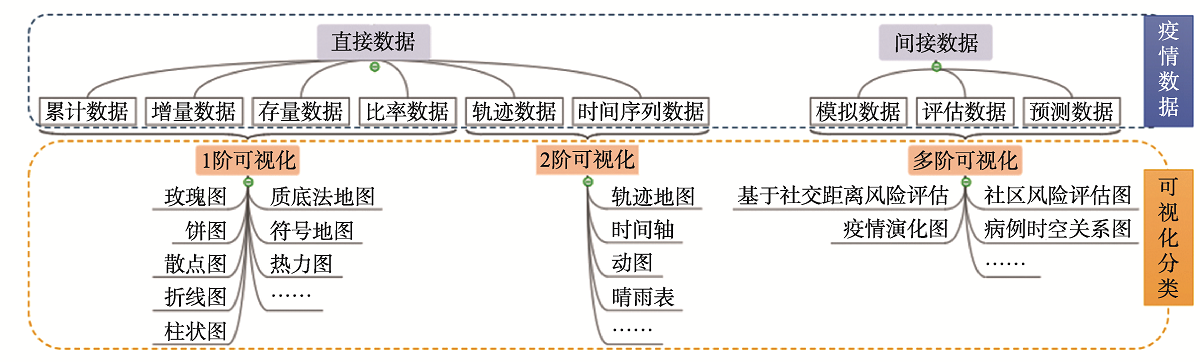
The COVID-19 epidemic has extremely attracted our attentions and lots of maps and visualization charts were created to represent and disseminate the information about COVID-19 in time, which exactly became a key role for the public to acquire and understand the quantitative information and spatial-temporal information of COVID-19. The paper analyzed the dimension of data for COVID-19 and processing levels about them, then divided the COVID-19 visualization into three types, that is 1-order visualization, 2-order visualization and multi-order visualization for COVID-19, based on direct data or indirect data of COVID-19 with the corresponding visualization methods, characteristics and information transmission Shortcomings and weakness of visualization methods for COVID-19 were analyzed in details, from the aspects of multiple scale unit in spatial data statistics, max value dealing in data classification, also many key design points were described including color connotation in disease visualization, the influences of area / unit size in visualization, symbol overlapping, multiple-scale heat maps and labels in statistical tables. The paper indicated the visualization traps of COVID-19, such as misuse of visual effects and excessive visualization, and reasonable abilities of COVID-19 visualization including map-story narrative methods and visualization pertinence for specific problems should be considered sufficiently to provide the references for cartographers to design the maps and for readers to understand the maps.
YING Shen , DOU Xiaoying , XU Yajie , SU Junru , LI Lin . Visualization of the Epidemic Situation of COVID-19[J]. Journal of Geo-information Science, 2021 , 23(2) : 211 -221 . DOI: 10.12082/dqxxkx.2021.200301
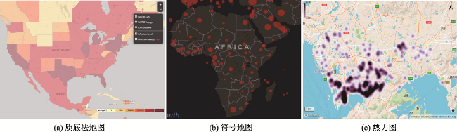
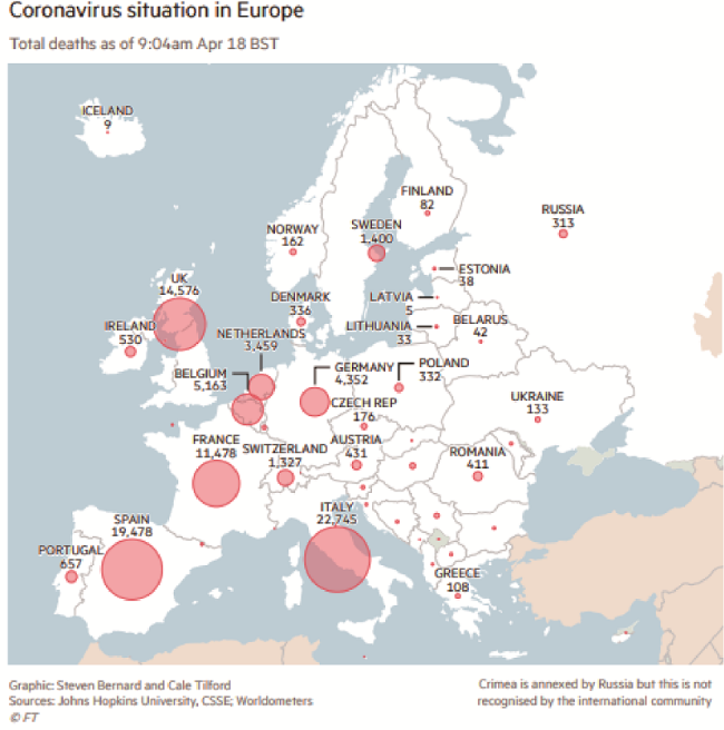
图2 疫情地图分类注:图(a)来源于https://hgis.uw.edu/virus/;图(b)来源于https://coronavirus.jhu.edu/map.htm。 Fig. 2 COVID-19 maps with different symbols |
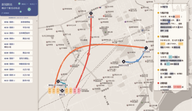
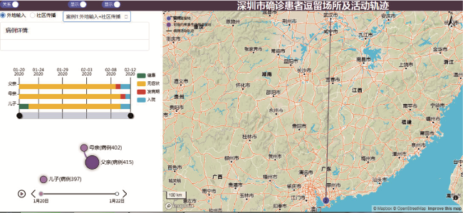
图4 疫情病例个体行踪可视化注:来源于www.bilibili.com/video/av98344374n。 Fig. 4 Visualization of personal trajectory about individual case |
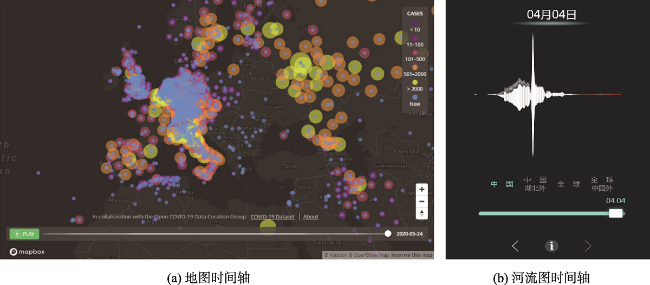
图5 疫情时间轴可视化注:图(a)图来源https://www.healthmap.org/covid-19/;图(b)来源http://zeelab.cn/WuhanThemeRiver。 Fig. 5 COVID-19 visualization with timeline |
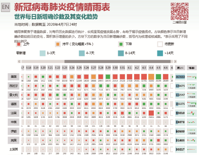
图6 疫情晴雨表可视化注:来源http://vis.pku.edu.cn/ncov/barometer/。 Fig. 6 COVID-19 visualization with barometer |
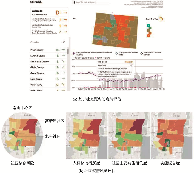
图7 疫情决策分析地图注:图(a)图来源于https://www.unacast.com/covid19/social-distancing-scoreboard#scoreboard;图(b)来源于mp.weixin.qq.com/s/i8cVCK3Ko79QoFWTF7cEpA。 Fig. 7 COVID-19 decision map |
图10 可视化中的极值处理注:图(a)来源于:https://www.ft.com/content/a26fbf7e-48f8-11ea-aeb3-955839e06441;图(b)来源于https://weibo.com/。 Fig. 10 Special value processing in COVID-19 visualization |
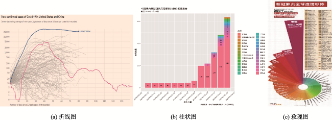
表1 不同图表表达优缺点Tab. 1 The advantages and disadvantages of different charts |
| 图表类型 | 表达内容 | 欠缺点 |
|---|---|---|
| 质底法地图 | 区域差异 | 整体上对面积小的区域表达不友好 |
| 符号地图 | 区域差异 | 面积小的聚集区域容易符号压盖 |
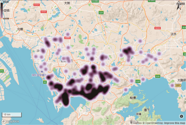
| 热力图 | 整体分布、扩散情况 | 区域具体数值 |
| 动态地图 | 历史演变情况 | Web应用动态图多,静态多以快照形式展示 |
| 柱状图 | 直观比较数据大小 | 空间信息表达弱 |
| 折线图 | 展示变化趋势 | 无法表达空间关系 |
| 饼图 | 比较数据大小 | 空间信息表达弱 |
| 河流图 | 类别之间比较和各类变化趋势 | 空间信息表达弱 |
| 晴雨表 | 类别比较和变化趋势 | 无法表达空间关系 |
| [1] |
李立明, 王艳红, 吕筠. 流行病学发展的回顾与展望[J]. 中华疾病控制杂志, 2008,12(4):304-308.
[
|
| [2] |
中国疾病预防控制中心. 新型冠状病毒肺炎聚集性疫情流行病学调查指南[EB/OL]. 2020- 2- 13. http://www.chinacdc.cn/jkzt/crb/zl/szkb_11803/jszl_11815/202002/t20200220_213405.html
[ Chinese Center for Disease Control and Prevention. A guide to the epidemiological investigation of novel coronavirus pneumonia clustered epidemic situation [EB/OL]. 2020- 2- 13. http://www.chinacdc.cn/jkzt/crb/zl/szkb_11803/jszl_11815/202002/t20200220_213405.html
|
| [3] |
|
| [4] |
|
| [5] |
|
| [6] |
|
| [7] |
李德仁, 邵振峰, 于文博, 等. 基于时空位置大数据的公共疫情防控服务让城市更智慧[J]. 武汉大学学报·信息科学版, 2020,45(4):475-487,556.
[
|
| [8] |
|
| [9] |
杨伊静. 大数据:打造战“疫”利器[J]. 中国科技产业, 2020(4):7-8.
[
|
| [10] |
孟郁洁, 戚晓鹏, 王松旺. 急性发热性疾病监测系统设计与实现[J]. 医学信息学杂志, 2019,40(5):36-40.
[
|
| [11] |
周奕洋, 张泽, 钱庆. 肿瘤流行病数据可视化系统设计与应用[J]. 医学信息学杂志, 2016,37(5):46-50.
[
|
| [12] |
张振华, 吴开超. 基于Twitter的流感疫情可视化系统[J]. 计算机系统应用, 2015,24(3):69-74.
[
|
| [13] |
朱梦泽, 赵海英. 叙事式可视化综述[J]. 计算机辅助设计与图形学学报, 2019,31(10):1719-1727.
[
|
| [14] |
白净, 吴莉. 健康传播中的可视化应用——以新冠肺炎报道为例[J]. 新闻与写作, 2020(4):31-36.
[
|
| [15] |
陈晓慧, 徐立, 葛磊, 等. 传染病传播数据可视分析综述[J]. 计算机辅助设计与图形学学报, 2020,32(10):1581-1593.
[
|
| [16] |
沈雨尘. COVID-19疫情数据的时空地理空间可视化分析(上篇)[EB/OL]. 2020-2-20.mp. weixin.qq.com/s/ByBSV0K1SpMwC-N12rbQfQ.
[
|
| [17] |
疫情地图项目组. “说谎”的疫情地图,隐藏了什么? [EB/OL]. 2020-1-31.mp.weixin.qq.com/s/U9BMlPVVPy N_rjv_HT1R_w.
[ Epidemic Map Project Team. What is hidden in the "lying" epidemic map? [EB/OL]. 2020-1-31.mp.weixin.qq.com/s/U9BMlPVVPyN_rjv_HT1R_w. ]
|
| [18] |
Kenneth Field. Mapping coronavirus, responsibly[EB/OL]. 2020-2-25. www.esri.com/arcgis-blog/products/product/mapping/mapping-coronavirus-responsibly.
|
| [19] |
孙远波, 闻芷艺, 徐瑞鸽, 等. 新型冠状病毒肺炎疫情数据可视化设计综述[J]. 包装工程, 2020,41(8):51-62.
[
|
| [20] |
ESRI. 对分级符号的数字字段进行分类[EB/OL]. 2020-5-25. desktop.arcgis.com/zh-cn/arcmap/10.3/map/working-with-layers/classifying-numerical-fields-for-graduated-symbols.htm.
[ ESRI. Classify the numeric fields of the grade symbol[EB/OL]. 2020-5-25. desktop.arcgis.com/zh-cn/arcmap/10.3/map/working-with-layers/classifying-numerical-fields-for-graduated-symbols.htm. ]
|
| [21] |
李楠. 疫情期间的信息化视觉思考(三):数据可视化[EB/OL]. 2020-4-22.mp.weixin.qq.com/s/CNmboW1yW DGI3I-JogJSkQ.
[
|
| [22] |
|
| [23] |
张洪岩, 周成虎, 闾国年, 等. 试论地学信息图谱思想的内涵与传承[J]. 地球信息科学学报, 2020,22(4):653-661.
[
|
/
| 〈 |
|
〉 |